Product Overview:
This process log documents the design of a smart shower control interface where users can use it to visualize information of the water temperature, the current volume of water, and the source of water. The goal of this design is to improve accessibility and usability during everyday shower routines. In this project, I explored how to utilize my design to better respond to the physical conditions of a bathroom environment, where users often have wet or soapy hands and limited visual attention by making a low-fidelity physical prototype and gathering feedback on possibilities on improvement from two rounds of critique and user testing.
The design consists of two connected components: an interface that is on the wall which displays real time information about water temperature, water flow volume, and water source, and a handheld wand that allows users to direct control through physical buttons and a slider.
In this log, I will describe how I brainstormed based on defined user needs, made decisions on which final design I should go for, gathered feedback from users and peers, and identified parts that should be improved. I also document the reasoning behind key decisions and how these choices work better in supporting my target users.
Ideation:
The goal of this design is to make a digital shower control interface where users can use it smoothly even with soapy hands and limited visual information. In this section, I will explain how I iterate throughout these three ideas to better align with my design goal.
I started with thinking of which part in this design description will make it better than the product we are already using now. I tried to list out the pain points when I was using the shower control system in my home.
- I don’t know the exact temperature during taking a shower so every time I need to turn the controlling bar left and right, trying to find the “right spot.”
- There is no clear sign of how to switch between different water outputs so every time I need to guess if I am at the correct valve.
- The flow of the water that comes out is not stable every time, and it is the same level of difficulty to find the “right spot” as the temperature.
- All of these above becomes extremely hard when it comes to a soapy hand or limited visual information after I wet my hair.
While finding some ideas by gathering inspiration from Pinterest, I thought about how I can also stress these pain points using my design as a solution.
Idea 1:

This idea is a fully touch screen control display with the handheld wand attached magnetically on its right. I tried to curve any corner for the safety of the user because I saw a lot of smart shower control displays on Pinterest have sharp corners which made me concerned about the danger of falling down during a shower. Below the temperature there is a swiper where the user should first click the selection button to choose which control they want to adjust, and then use the swiper to edit. I realized that I partially solved the pain points by providing clear information, but the process of adjustment is still strenuous. At the same time, referring back to my design goal, where this could hardly work during limited vision or soapy hands. So I build on top of this, trying to figure out a better way to stress on pain points and align with design goals.
Ideas 2:

Compared with idea 1, idea 2 uses physical buttons to control the temperature, level of water volume, and switch between different water sources. This makes it easy to use with soapy hands because they don’t need to operate using complicated gestures which heavily increase the accessibility and usability, thus further aligning with the design goal. I added a bluetooth connected light to tell the user that this handheld wand is connected to the base part on the wall and can be modified using the buttons on the base part. This could also give users confidence when it comes to electronic control rather than mechanical control. I tried to use a physical holder to hold the wand because there is a chance that the magnetic attachment will fall down. Later on, I found out that using a horizontal layout for display will lead to confusion and the size is not necessarily to be that big. There is also a chance that the user will accidentally mis-operate. So I decided to move forward to the third idea.
Ideas 3:

Finally, in the third idea, I choose to put the display screen in the middle and have a ”O” shaped wand magnetically attached to the control screen. By doing this, I solved the problem that the wand will fall down while maintaining the aesthetic design for its appearance. The screen is for information display, where two buttons on it has a higher level of control than individual components. The one on the left is a lock where the user can avoid accidentally pressing on the button to change the temperature or switch the water source. The one with the resume icon on it is the button controlling whether this is water coming out from any of the three water sources. Users can quickly pause during the shower to use shampoo, and return back to all the same settings by simply pressing continue (resume). I transfer the button to control the temperature and the water volume, as well as the switcher of the water source to the wand because the user might want to change the temperature with limited vision and a soapy hand. In this way, they can quickly reach that goal, making this idea the top among three ideas in aligning with design goals. It also solved all of the pain points I listed above.
Prototype:
In the sections above, I explained how I iterated through ideas by following the design goal and stressing the pain points. In this section, I will briefly talk about the process of making my testable physical low-fidelity prototype and showcase how it looks.
First of all, I found a shipping box, and simplified my design to a geometric shape. The rough shape of my prototype will be a small box in the middle, a larger box representing the head with a rectangular hole in the middle, and a cylinder for the handle.

I used a pencil to punch holes on the board to make sure I knew the edge and then lined up the holes to draw the cutting line. Then I used glues and tape to make it a 3 dimensional prototype. After that, I used a sharpie to draw the display on the screen and icon on the buttons as well, cut some small pieces of cardboard to represent the texture of physical buttons.

Later on, I enhanced the details of the small holes on the head, and used sticky notes to mock a interactive interface. Here is how it finally looks.


Feedback:
In class, my peer and I worked in groups of three for two rounds of critique. In the first round of critique, I gave them my prototype and let them figure out how to use it while I remained silent. In the second round of critique, I told them the areas where I wanted more feedback: how to achieve better display effects on the screen or a better mapping relationship between the two parts. This is the feedback I received:
Round 1:
What works well?
- My peers recognized that the system had two distinct parts (wall module + handheld wand).
- The interface successfully communicated that the device was interactive rather than passive hardware.
- My peers were able to imagine realistic usage scenarios.
What could be better?
Unclear System Mapping:
- My peers did not understand the relationship between the wall module and the handheld wand.
- It was unclear which part was the main controller and which was the output device.
Slider Confusion:
- My peers were unsure whether the slider was: interactive or decorative/part of a touchscreen or physical control/controlling temperature or water flow
- The location of the slider on the handheld felt disconnected from the wall unit.
Feature Misinterpretation:
- “Pulse” was mistaken for a speaker/audio function.
- The current temperature display was seen as unnecessary.
- The lock/unlock button lacked a clear purpose.
Physical Design Concerns:
- Handheld unit felt larger than expected.
- My peers expected a hanger/hook for placing the wand.
- Activation logic (mounted versus detached) was not obvious.
Round 2:
Move the slider back to the wall module to create clearer mapping.
Improve the display to better distinguish:
- Between: interactive controls and information-only elements
- Between: responsibilities of wall and handheld components.
After that, I conducted a semi-structured user testing. Here is what I got:
- “T” button not intuitive enough for users to know that they can increase the temperature by pressing it.
- Switcher should go back to the wall component.
Takeaways:
Feedback from both my peers and my participant reveal that my design did successfully align with my design goals and solved the pain points. But there this design have some minor issue that may or may not impact it functionality. It could be better if,
- I strengthen the mental model to “wall = control, wand = output”.
- Redesigning the “pulse” -> “Start/end”; “Lock button” -> lock sign, where it automatically locked and needs to press two times to unlock.
- Add clearer physical affordances (hanger + size adjustment).
Thanks for reading! : )
Technological Appendix:
AI usage:
- I used ChatGPT in correcting my grammar and typo;
- I discussed with ChatGPT of the overall structure of the blog;
- I used NotebookLM to help me organize user feedbacks;
- I discussed with ChatGPT of how I should plan my 1-minute user testing video;
- I discussed with ChatGPT of parts I should improve with the feedback I got.
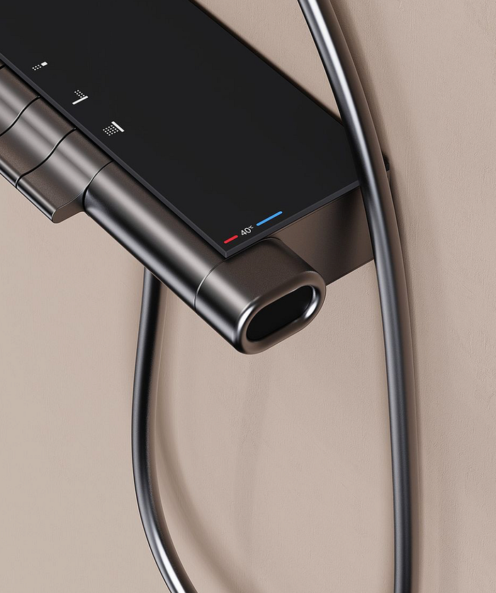
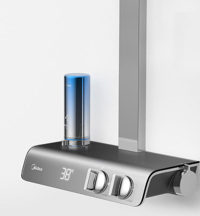
Inspirational reference:
Press enter or click to view image in full size