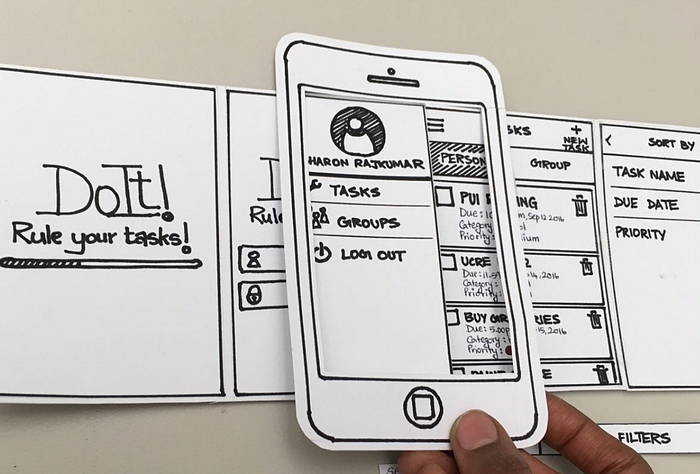
Product Overview:
This process log documents the design of a smartphone paper prototyping frame where the users can use the product as a showcase and test frame for their sketched-out wireframe for their participants. The goal of this design is to enhance functionality and usability, on the basis of helping user to test out their wireframe’s user flow, I also reached the part that helps the user to conduct the user testing with this product seamlessly and intuitively. In this project, I explored how to utilize my design to better respond to the user’s wireframe testing needs (or I should say I am a user of this product myself since I often conduct the user testing myself) and practiced my skills of building a 2.5 dimensional product with technics of designing a product by parts which can be used to assemble the strong enough 3 dimensional product using inserting and other structure without any glue or other material that can stick them together.
In this log, I will describe how I brainstormed based on defined user needs, made design decisions based on the evaluation criteria I made to determine if my product works, gathered feedback from users and peers, and identified parts that should be improved. I also document the reasoning behind key decisions and how these choices work better in supporting my target users.
Ideation:
The goal of this design is to make a frame for smartphone wireframe prototype which can be used in early phase user testing with build an intuitive user flow for both the interviewer who conduct the testing and the interviewee who is doing the testing. In this section, I will explain how I iterate throughout these different ideas to better align with my design goal.
I started with thinking of my own pain point while conducting user testing or being an interviewee doing the testing. I came up with these in my head.
For being an INTERVIEWER:
- I can not show my participants the user flow (or say I can not get good feedback on my user flow since they are not pretty clear what the flow is like by staring at my wireframes with bounding boxes and messy arrows). They have to spend a lot of time interpreting my user flow in wireframe.
- User can see all the wireframe at the same time which is not true in real applications. By knowing which step is the next step, users can easily reversely infer the step they should do to reach the next step which made me really hard to test out if all the interactions are intuitive enough for user to operate in real life.
For being an INTERVIEWEE:
- The instructions during the user testing of a wireframe is always unclear. The interviewer might give me some clue but what I got most is their unclear and messy sentences on the wireframe which made me hard to follow.
- I don’t have a sense of holding a smartphone while doing user testing. They always just give me several piece of paper with wireframe on it.
- When I want to give feedback on the wireframe, I seldom find the part I am looking for due to the fact that it is always not that structured.
Before finding some ideas by gathering inspiration from Pinterest and thinking about how I can also stress these satisfaction points using my design as a solution, I first came up with prototype evaluation criteria and follow these criteria to make some design decisions.
Prototype Evaluation Criteria:
1. FeasibilityThe paper prototyping frame should be able to hold with only one hand and conceal a 5-inch-wide paper screens without bending or collapsing during handheld use.2. UsabilityUsers should be able to insert, remove, and swap paper screens within 3 seconds per screen without instructions.3. DesirabilityWhen holding the frame, users should report that it feels more like using a real device compared to viewing loose paper on a table.4. ImpactThe frame should allow usability tests to be conducted with minimal facilitator intervention (no need to explain orientation or where to look).
Design Decisions:
The frame is designed for one handed, portrait orientation use, mimicking typical smartphone interaction.The frame targets 6-inch-wide paper screens, consistent with modern phone dimensions.The overall appearance should resemble a real mobile device with minimal bezels, while maintaining sufficient material thickness to ensure structural stability.Screen insertion and removal mechanisms (top, side, or back access) will be explored through sketching to evaluate speed and stability trade-offs.Hand placement and grip affordances will be investigated during sketching to support comfortable one-handed use.The primary testing context is facilitator led demo testing, prioritizing fast screen swapping and minimal explanation during use.
After having sense of what product I will be designing. I started my sketches.
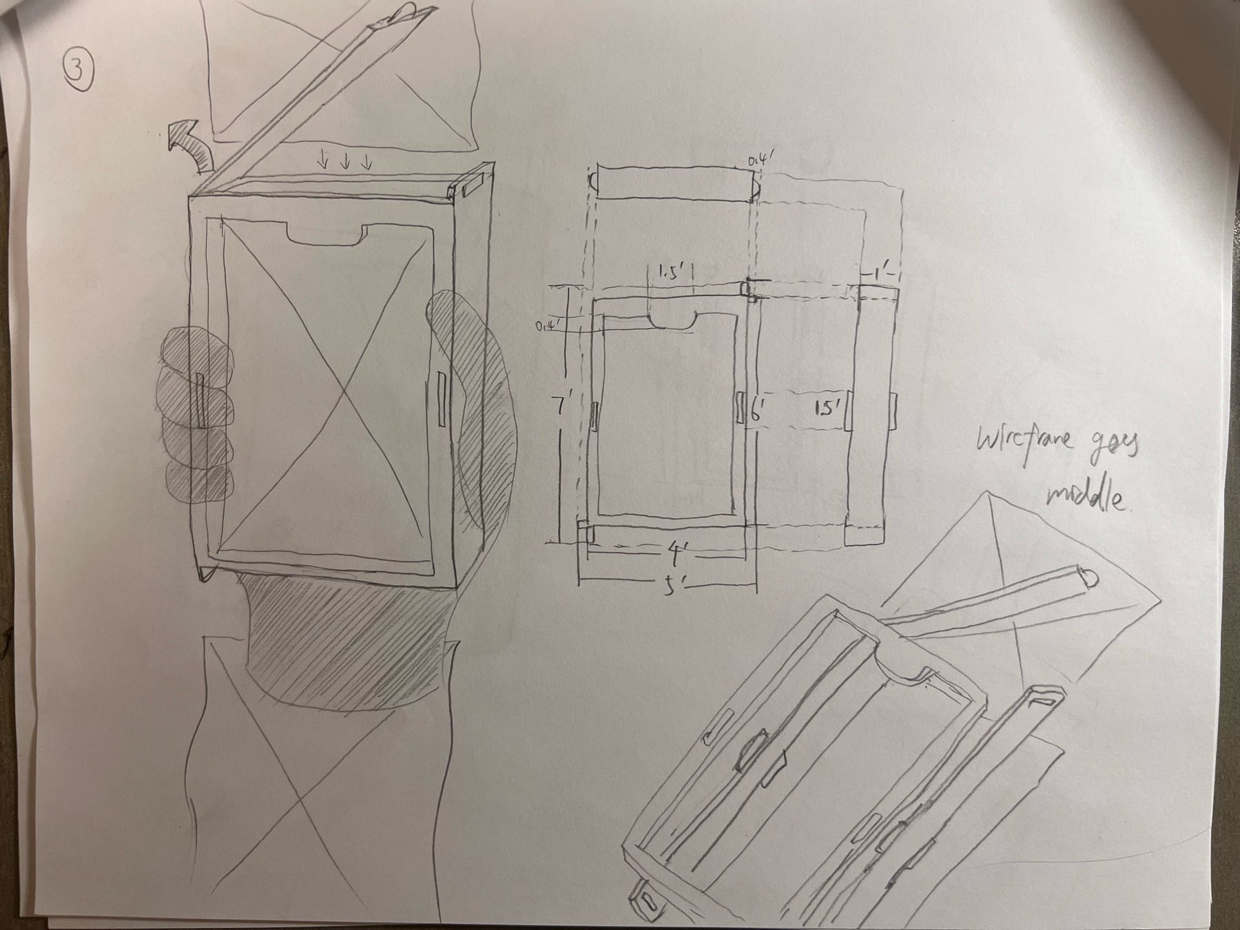
Sketch 1–4, 7:
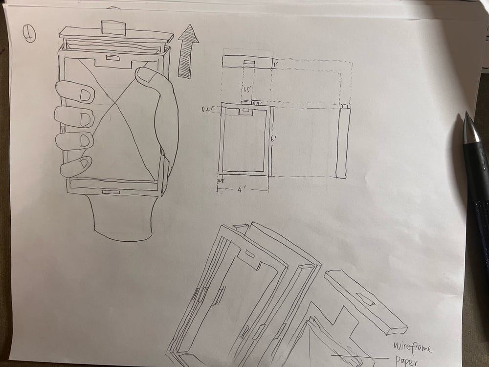
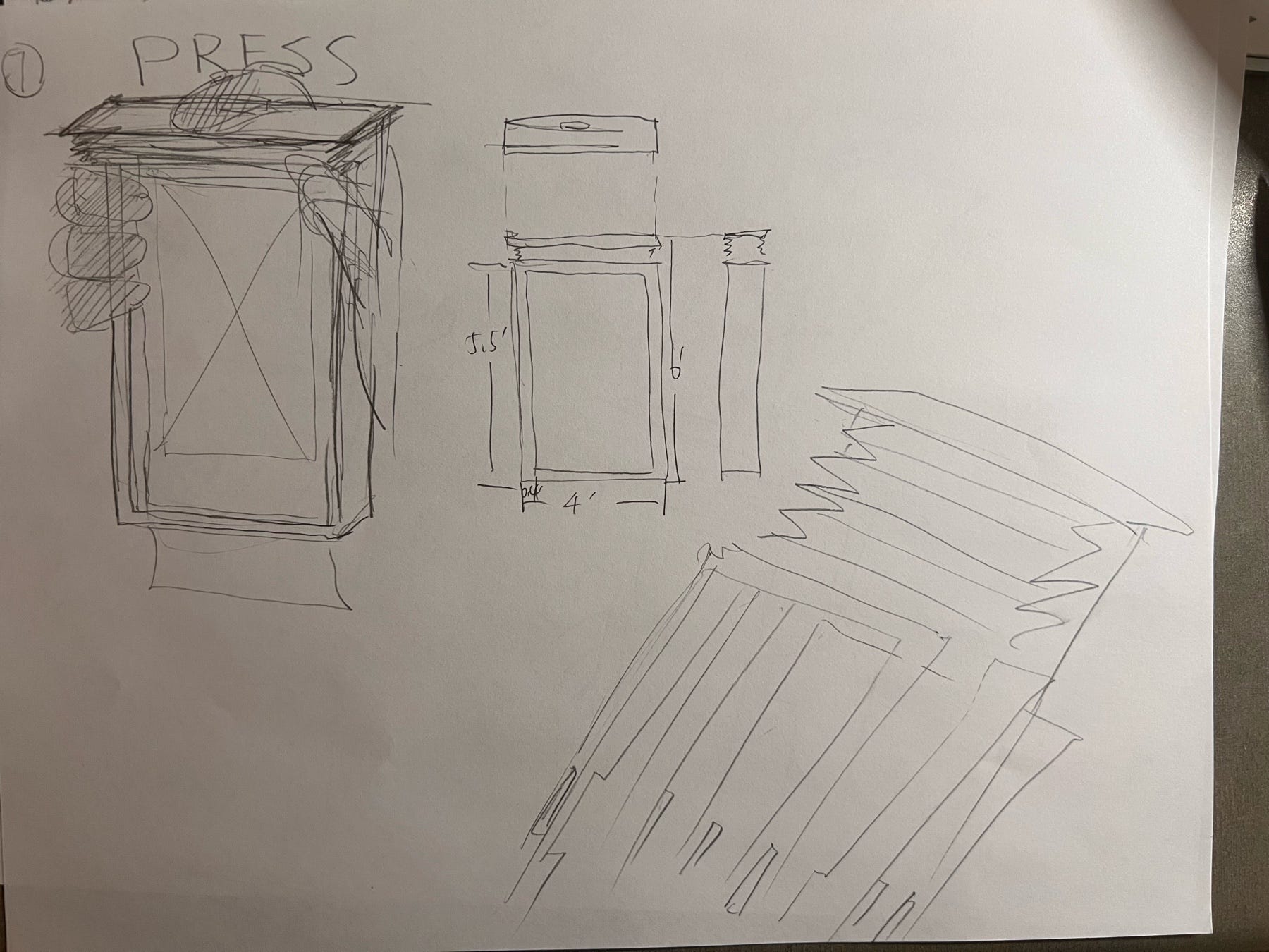
Sketch 1
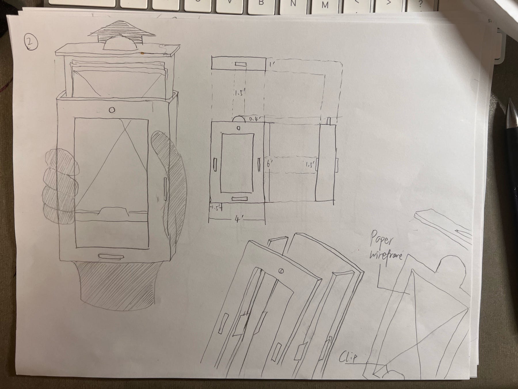
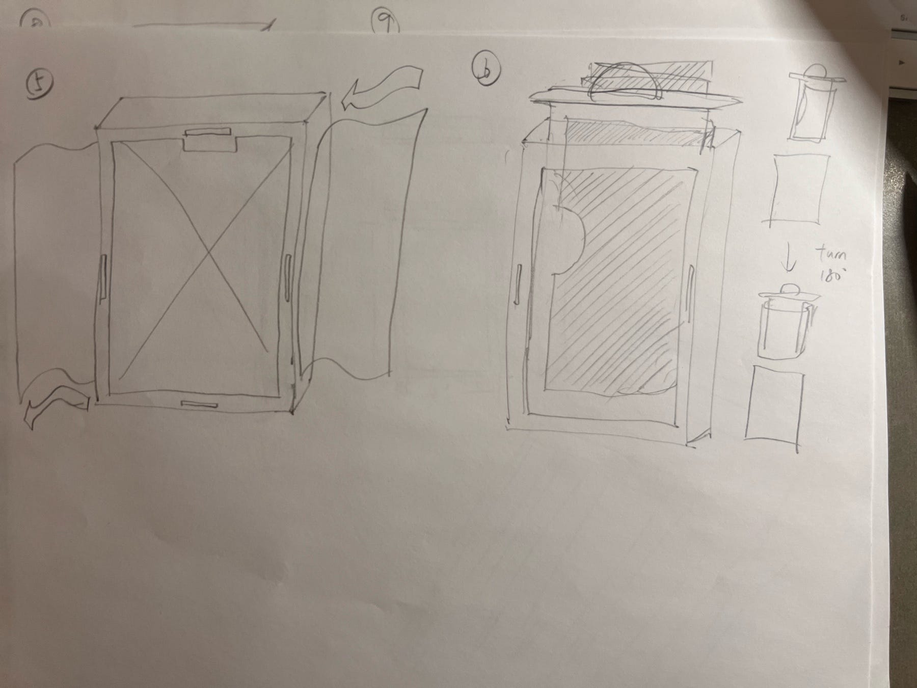
Sketch 2, 3
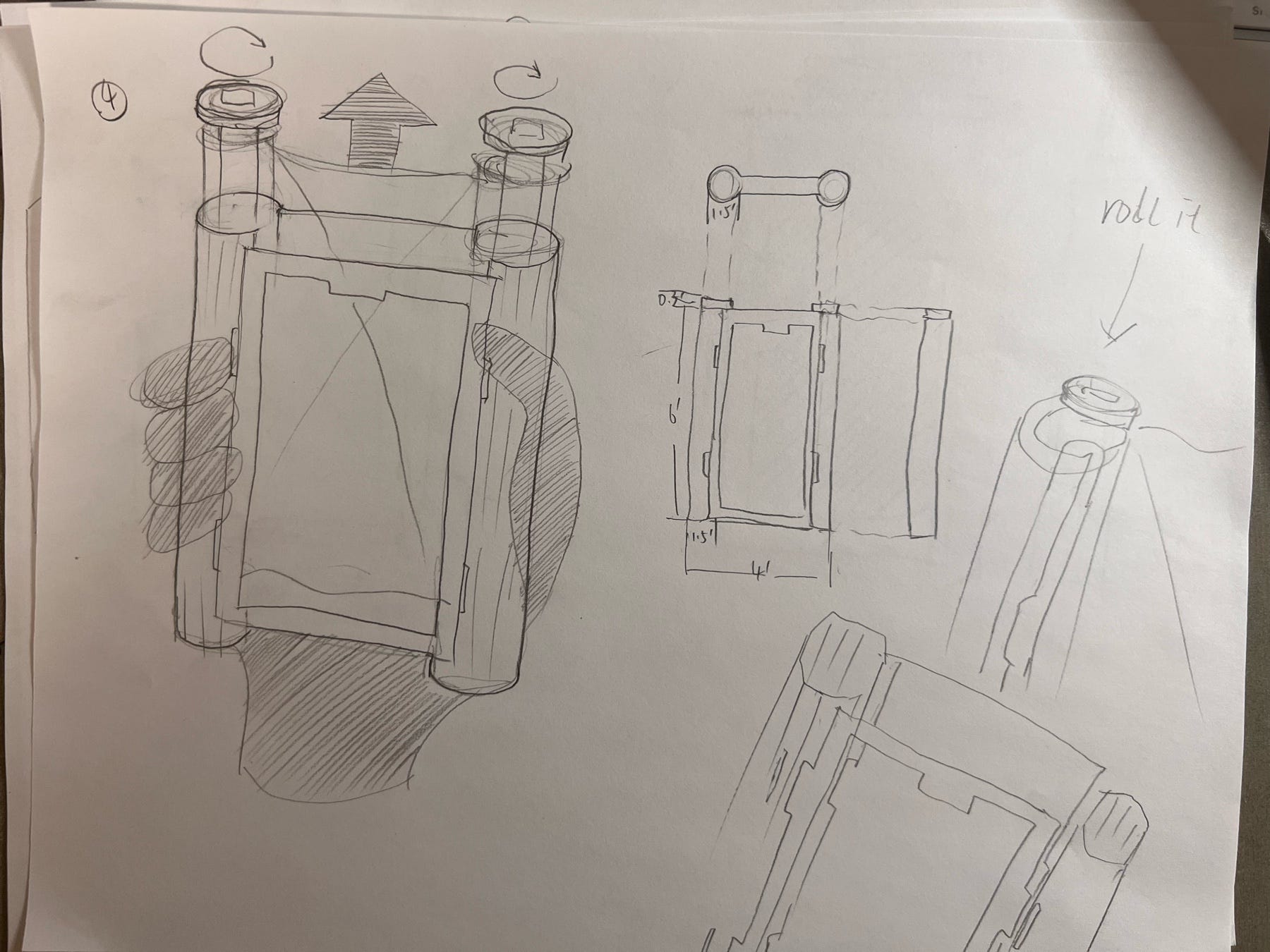
Sketch 4, 7
From sketch 1–2, I tried to test out my answer for my third design decision. The main difference here is the edge of the frame: prototype frame in sketch 1 has a much thinner edge compared to that of sketch 2. Although the thicker edge in sketch 2 might reduce the possibility of accidentally touching the middle frame (but to be honest, it doesn’t matter since it is just a piece of paper), and can hold it easily, it still can not cancel out the defect which is that it decrease the size of the wireframe a lot and make it less like a phone (cell phone recently don’t have a edge that wide). So I decided to apply thinner edge on the following sketches. For sketch 3, it is a different opening mechanism compared to the first two, where it has an opening to insert the wireframe from the top, and also an opening to drop the wireframe when all things is done. This is a testing of fourth design decision, and I like how fast it can switch between wireframe by wireframe. Prototype in sketch 4 and 7 has a different type of wireframes, which in these two sketches, wireframes are like a old-school cartoon books where all the frames are connected together in a storytelling way. Prototype in sketch 4 is like a film camera, where the wireframes are the “film”, and the frame showing wireframes is the place where film got exposed. The drawbacks of this is I can not make sure that the participant can turn to the “right” angle that show the wireframe completely. Prototype in sketch 7 has a folded paper wireframe which the user have to pull the paper on the bottom, and unfold only one piece of paper while other remains folded. This is way to complicated compared to others.
Sketch 5–6, 8–11:
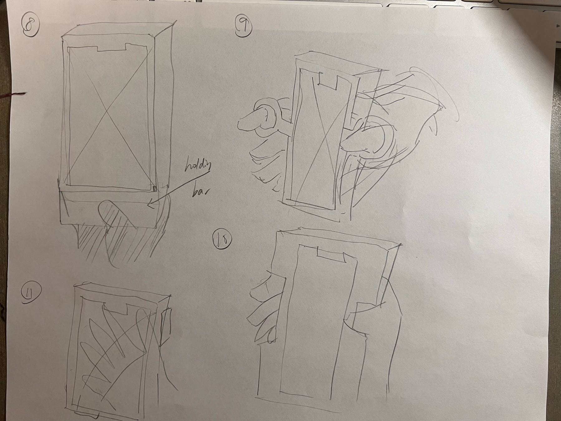
Sketch 5–6, 8–11
These sketches are the lab space where I tried out different ways of inserting papers and pulling papers out, as well as ways of holding the product. I choose to do the low-fidelity paper prototype using sketches back in sketch 1 and 3 because looking back to my pain points, evaluation criteria and design decisions, I think these two are the one that align with my design goal the most. (yeah so not always picking up the last version huh?)
Prototype:
In the sections above, I explained how I established my evaluation criteria and made sure I know what product I am making, then I explored different ideas and then made decisions on the two I should go for making a paper prototype by following the design goal. In this section, I will briefly talk about the process of making two testable low-fidelity paper prototypes, and then use it to iterate to a better prototype in fidelity level (with vector editor and laser cutting machines), and showcase how it looks.
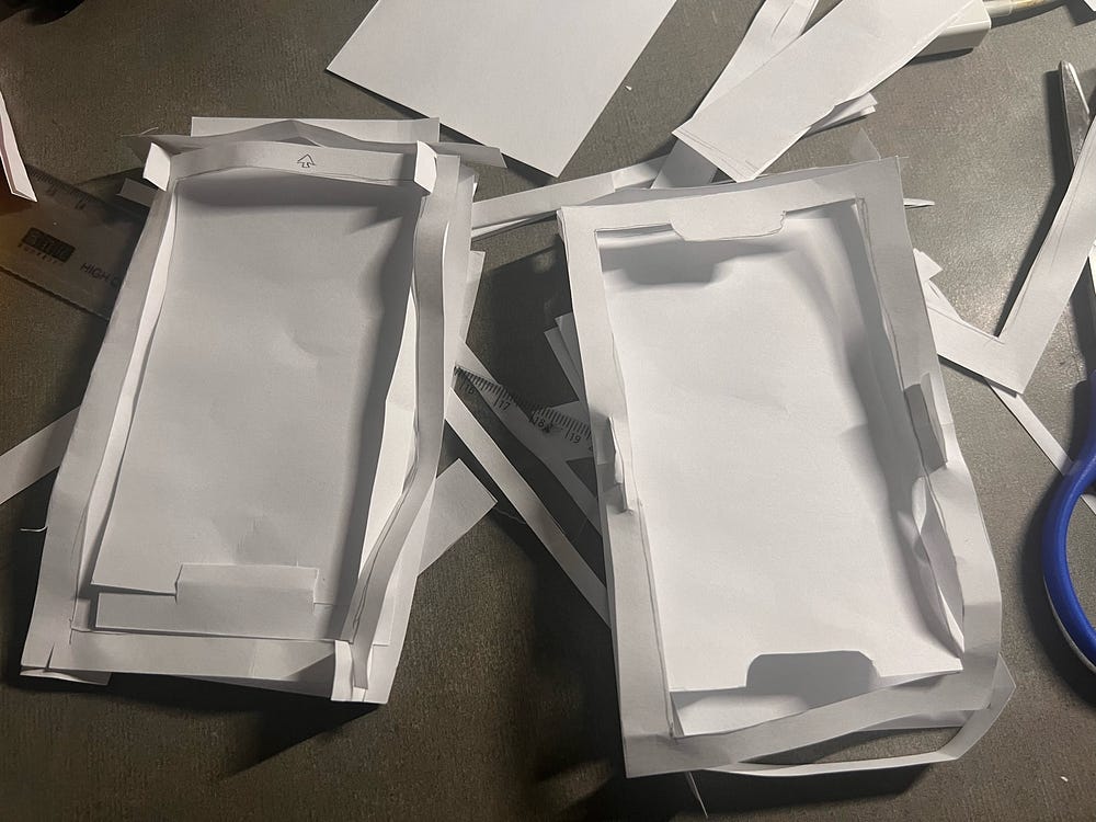
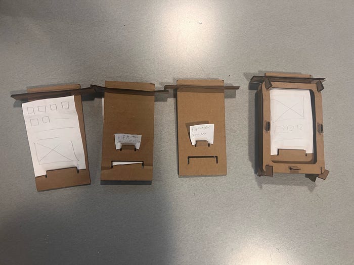
Left: Paper prototype for sketch 1; Right: Paper prototype for sketch 3
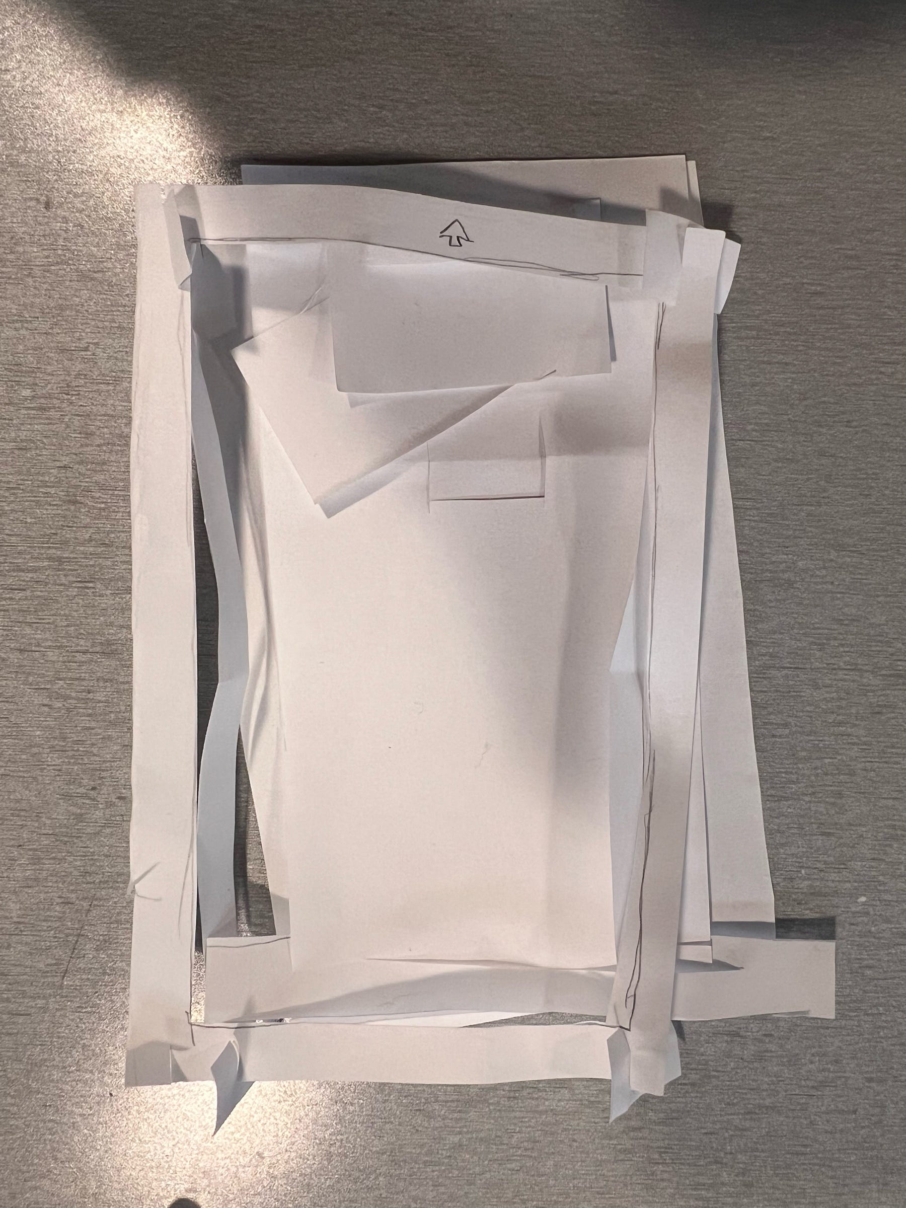
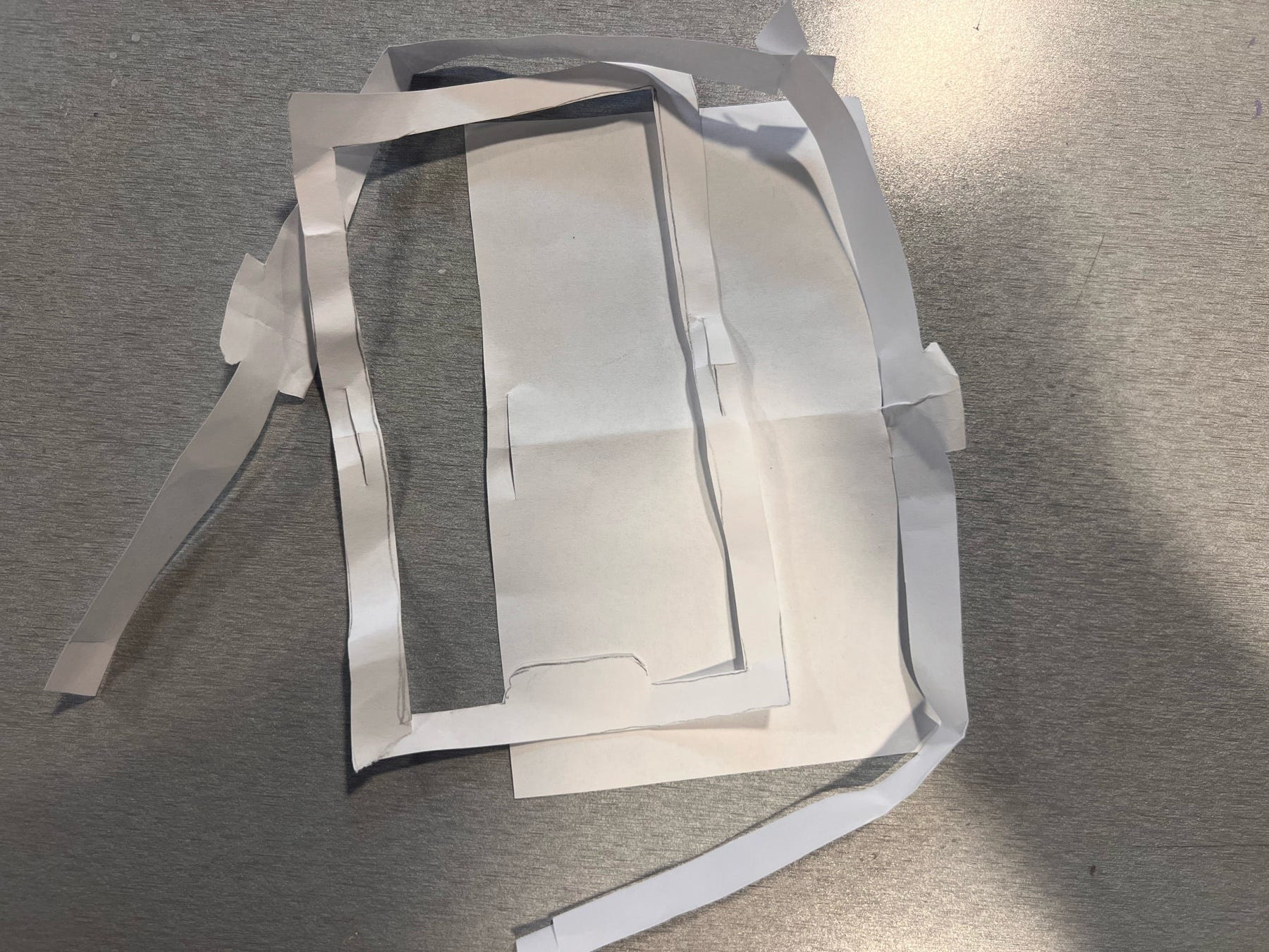
Left: Paper prototype for sketch 1; Right: Paper prototype for sketch 3
In the paper prototype for sketch 1, I made some subtle changes: I changed the way different parts are connecting to see if this is more stable. The paper prototype of sketch 1 has problem in structure since there is no parts connecting the middle of the front part of the frame and the back part of the frame, the frame is moving left and right when I held it in my hands. he paper prototype for sketch 3 has similar problem where it had connection in the middle but not four corners so these corners are movable which made it less stable. I also got inspiration from my second sketch, and decided to make multiple inserts board in the middle, and place them on the table to switch easily between different wireframes. I kept that in my mind, combined the structure of connection in these two paper prototypes, and made my final one.
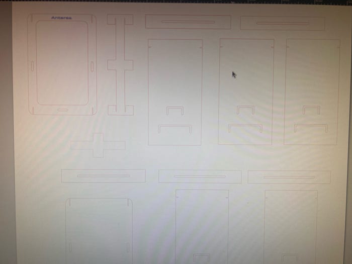
Vectorized design on Inkscape
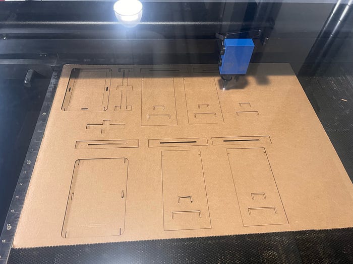
Laser cutting
Final design
This is my final design, aligned with my design goal, passed the evaluation criteria, and satisfy my design decisions. There are two cut slot on the insert board. The one on the bottom is for stabilizing the wireframe. And the smaller on the top of that is the one that can leave tips and instructions for participants. The interviewer first stabilize the wireframe, and leave some comments on it such as “You can move to this page if you click on XXX” or instructions of how to operate the page. Interviewer should make sure that these two are in opposite side of the board. Then the interviewer flip the board to hide the wireframe from the user, and allow user to remove the board from the middle of the cell phone prototype frame, with the flipped next frame waiting to be inserted. By doing this, all the pain points I listed are solved while maintaining an easy way of operating this.
Feedback:
In class, my peer and I worked in groups of three for one round of critique. In my round of critique, I gave them my prototype and let them figure out how to use it while I remained silent. This is the feedback I received:
What works well?
- The prototype is stable and structurally strong, and it can stand upright without external support.
- The main component can be easily inserted and removed, making the basic interaction smooth and low-effort.
- The overall physical construction feels robust and reliable, which gives users confidence when handling the object.
What could be better?
- The comment sticky notes part may get stuck when being pulled out, which creates friction in repeated use and could affect long-term usability.
- The small cut out for comment sitcky notes is confusing in terms of its function and how it should be used.
- Some users initially misunderstood the direction of interaction, suggesting that the affordance is not immediately clear.
- The form feels like it consists of multiple frames or layers, which may increase cognitive load if the structure is not clearly communicated.
Takeaways:
Feedback from both my peers and my TA reveal that my design did successfully align with my design goals and stress on the pain points as well as passing my criteria based on design decisions. But there this design have some minor issue that may or may not impact it functionality. It could be better if I,
- Clarify the affordance to make the direction of interaction more intuitive.
- Redesign the comment sticky notes part to reduce friction and prevent it from getting stuck.
- Simplify the small components so their functions are easier to understand.
Acknowledgment:
Special thanks to my group members, TA Nichole Sams and Instructer Brock Craft for their valuable feedback.
Thanks for reading! : )
Technological Appendix:
AI usage:
- I used ChatGPT in correcting my grammar and typo;
- I used NotebookLM to help me organize user feedbacks;
- I discussed with ChatGPT of parts I should improve with the feedback I got.
Writing reference:
- I used the overall structure of the blog from my last blog as a reference of this blog. Some of the words written by myself are the same (some transition sentences and words).
- Here is my reference blog: https://antaresyuan.site/blog/hcde-351-a2-soft-goods-prototype-shoulder-bag-design/
Inspirational reference:
https://www.pinterest.com/pin/833869687282567882/